There is a common convention among higher ed websites to combine and advertise News and Events all within one giant interface. Perhaps the rationale behind this tactic is to represent the campus as a very busy environment.
However, what tends to happen is that the user is given a cluttered, confusing array of mixed articles and dates that becomes overwhelming and impossible to sort through. After reviewing a variety of successful and unsuccessful News and Events pages, I have compiled a quick list of recommendations that I hope will bring about the end of the anxiety-causing hodge-podges that are more common than not.
Maybe it’s Time to get Different Pages?
- Users need to be able to clearly identify and find when searching for information. By separating news stories and press releases from important dates and events, a user can quickly find what they are looking for and digest what it is they are reading. What should be avoided is having a user search for a specific article or news, and not be able to find it within an efficient amount of time.
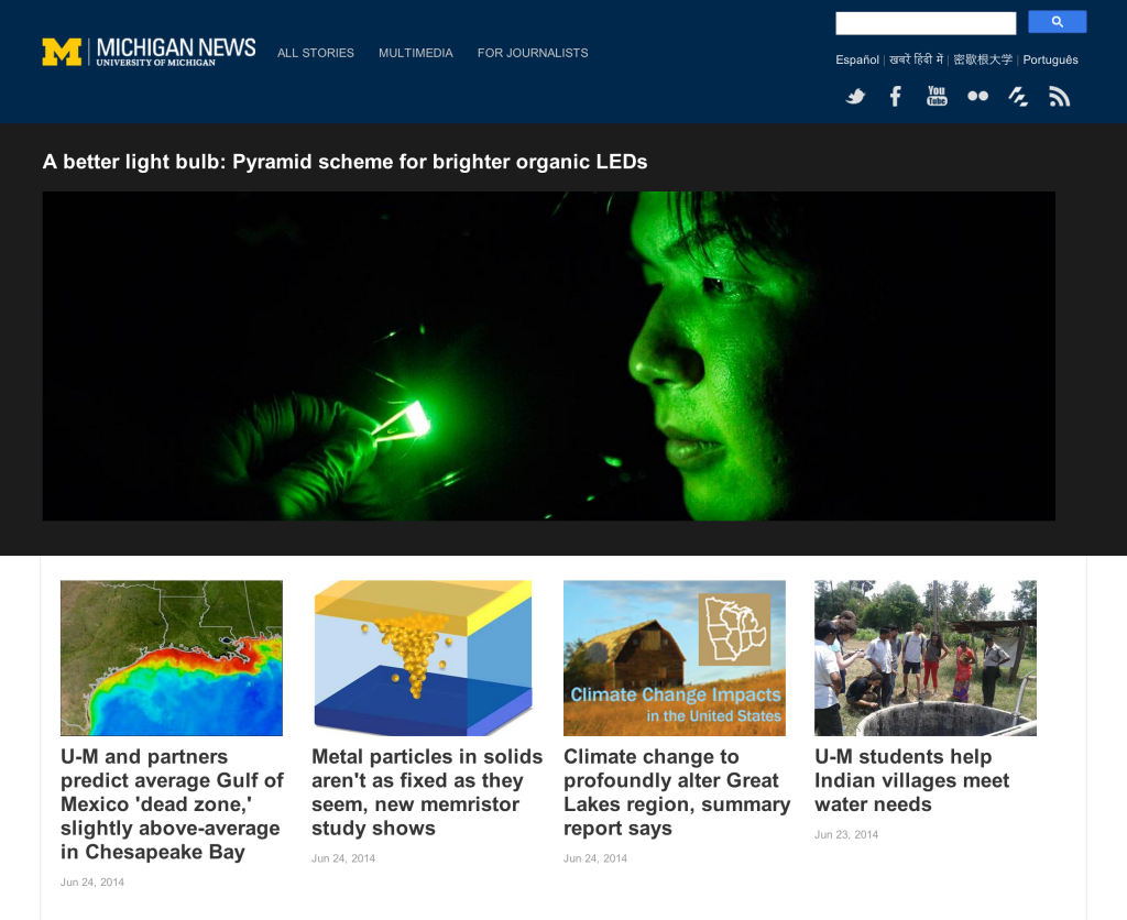
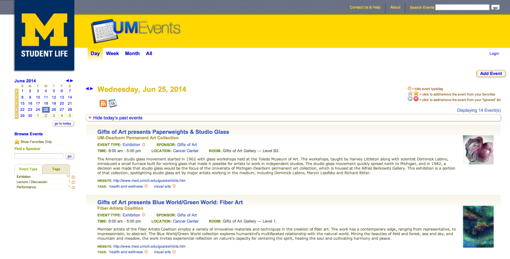
- Preferably, have two separate pages for News and Events. A great example of this tactic can be found by visiting the University of Michigan’s homepage. It is perfectly fine for the landing page to have both news stories and events, but only enough to entice the user to read more of each section. This allows two different experiences and a greater impact on the user.
If there isn’t enough Real Estate, then Separate Visually
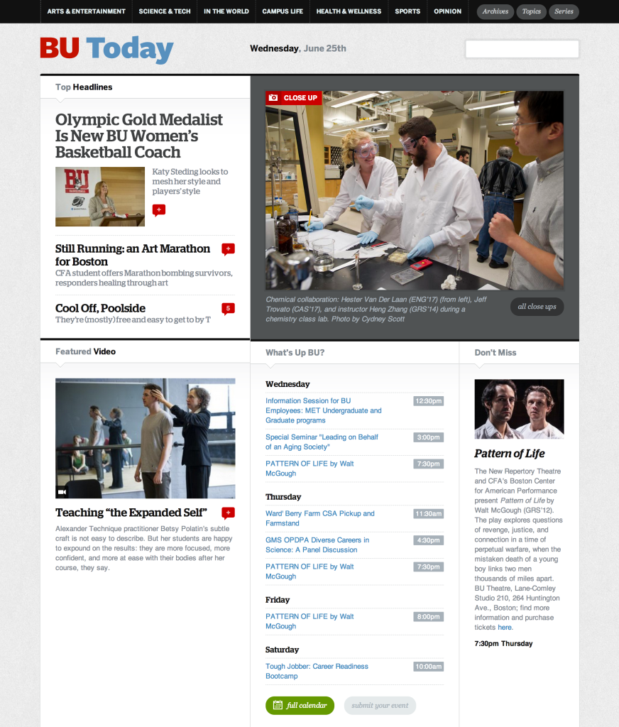
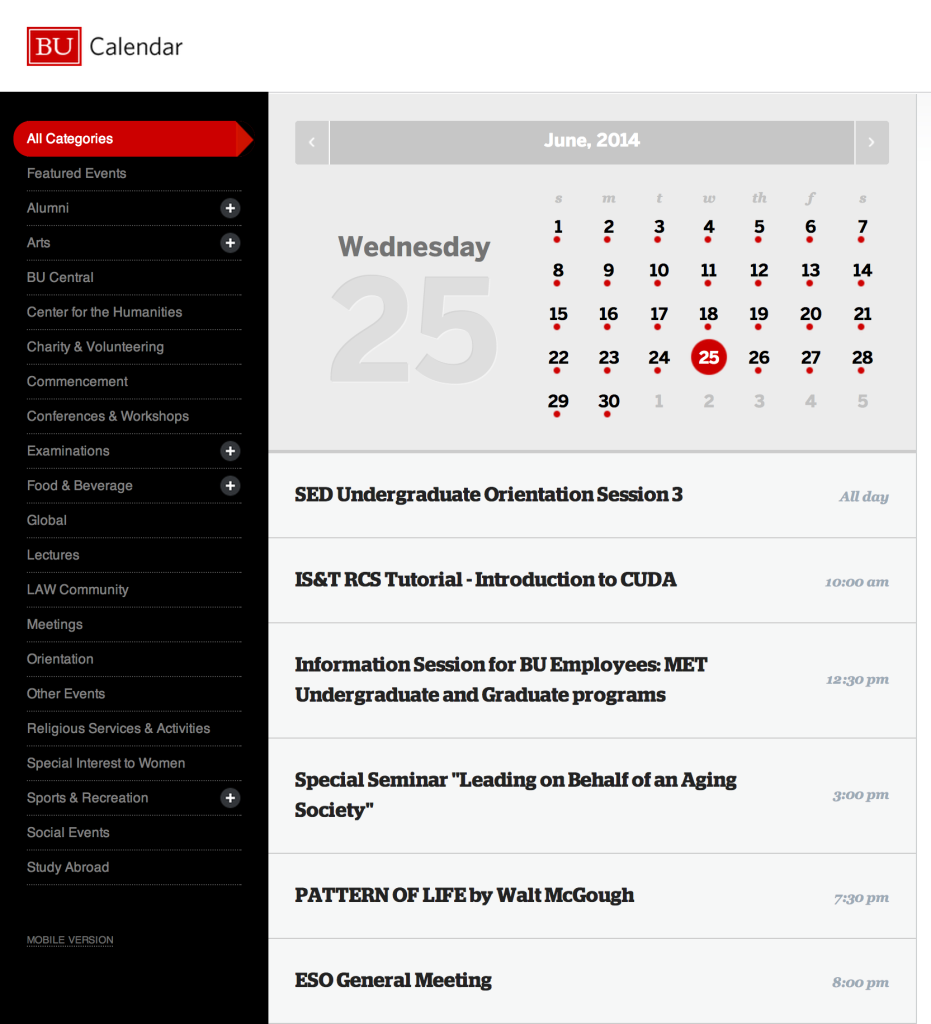
- If there is not enough content to have two separate pages, then the “News” should be visually distinguished from the “Events.” BU Today does a great job of advertising important events among featured stories and top headlines. There is a very clear section of the website that is perfectly dedicated to JUST events. This means that the user can go straight there and find every event they may need to know about—no searching. If News and Events have to co-exist, they should do so harmoniously, and keep both their houses clean. Reducing clutter improves readability.
Remember, “News” functions differently from “Events.”
Think: Newspaper versus Calendar.
- A News page is a source of information and compelling stories about the respective campus. It should be filled with engaging media and memorable articles that can be shared and bookmarked. The user should be able to easily digest the article, and move from story to story.
- An Events page is essentially a calendar of dates. Users should be able to glance through by days/weeks/months/years to gain an overview of the variety of events that a campus offers.
- Do not design the News titles, excerpts, and thumbnails to be identical to Events listings. If they are to be classified as two different aspects, then they should be designed and function as such.
Categorize and Filter
- There is usually a lot of information being presented to the user within a News and Events page. This is where filtering comes in: allowing a user to filter through content to help expedite the search process of finding what is most important. Categorizing can be done in many different ways (text, icons, color), but should always be paired with a tagging system to support a successful searching function. See below for a great example of this from University of Chicago.
Provide a reason to read
- A page that only showcases links and text can wash over the user and cause an immediate loss of interest. Provide imagery and video when appropriate to help support important stories and spotlighted events. However, when every single story and event is accompanied by a thumbnail image, eyes glaze over and users run away from fear of being overwhelmed. Hierarchy is key here. Hierarchy creates interest, and interest creates (happy) readers.
Update. Update. Update.
- A page that only showcases links and text can wash over the user and cause an immediate loss of interest. Provide imagery and video when appropriate to help support important stories and spotlighted events. However, when every single story and event is accompanied by a thumbnail image, eyes glaze over and users get overwhelmed and bounce. Hierarchy is key here: it creates interest, and interest creates (happy) readers.
In conclusion, creating great news/events content is just the first step. In order to make that content sing, give some careful thought as to how that content is organized and visually presented.


