As mStoner’s new senior creative director, many of my future pieces will grapple with design and visual communication. This time around, however, I’m putting on my pivot tabling, behavioral psychology hat. Mobile user behavior is fascinating…we navigate the web while waiting in line for coffee, stopped at red lights, and as some of us might admit, while walking down the street. Greg’s post about mobile traffic trends provides the perfect platform for exploring how mobile visitors consume site content and navigate differently than desktop users.
As Greg noted, mobile share of traffic is certainly trending upward. To prepare to provide a better experience for these increasing numbers of users, it’s important to note that mobile users have different goals, habits and motivations. These users even have different sense of time–most phone screens timeout after several seconds and the coffee line is only so long, so users are hyper-aware of the moments they spend waiting for content. Over time, this has conditioned us to develop a truncated attention span.
According to our analysis and benchmarking of .edu sites, the behavioral data bear out much of what this shorter attention span would suggest.
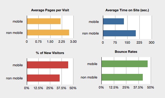
Across the board, desktop users spend more time on site. Mobile users look at fewer pages per session on their devices, and, in most cases, bounce more easily than desktop users. One interesting insight was that the percentage of first time visitors to the site was consistently higher in the mobile population. Of course, this is a tricky metric, since a “new visitor” who visits as a mobile user may have accessed the site in a browser many times before. Still, making a site intuitive for new users is a worthy goal, no matter the motivation.
Optimizing your site’s performance for mobile viewports isn’t complex or mysterious. Here are some tips to help boost engagement on smaller screens:
Minimize site load time at small resolutions. A breathtaking feature image looks amazing on-screen, but while waiting for a heavy download, mobile users are very inclined to flick the back button and abandon their exploration. As Doug Gapinski mentioned in an earlier post on lessons for responsive design, five seconds tests the upper limits of mobile users’ patience.
Borrow from the advertising world. At your site’s smallest breakpoint, try shifting to an alternate headline with a clear messaging call to action (CTA). Think, “See How Sea Otters Form Social Circles” rather than “Our Research: Sea Otters are Social”. Asking the user to do something concrete helps them focus and increases the likelihood that they will follow through. Even better, run an A/B test to try both headlines across all viewports. You may find that a more active, CTA-focused headline will help your desktop users, as well.
Make it feel clickable. Creating irresistibly clickable link states for small screens is a simple CSS trick. On a touch device, it’s easier to click on a box or color field than an isolated line of text. By adjusting the appearance of your links and expanding the click area, you can help the user feel confident that their finger will land on the intended target. In doing so, you’re boosting your site’s usability and your users’ confidence.
tl;dr conclusion: A satisfied visitor is more likely to stay engaged and read additional content; if you assume you have five seconds to make a first impression and help your users navigate as quickly as possible, you’ll likely start to see your mobile engagement rates rise.