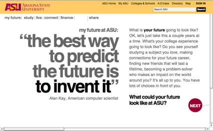
In case you’re wondering, that’s a screenshot of a CASE Gold award winner this year: the Online Viewbook from Arizona State University.
We’ve just completed the Judges’ Report for the 2011 CASE Circle of Excellence Awards for Category 11, Websites. Read on for some thoughts about what we saw this year and follow the link below to download a copy of the entire judges’ report.
The judging this year was held in early April at Concordia University in Montreal, Quebec. We’re grateful to the university for hosting this year’s judging—and especially to Shelagh Pedeen and Laurie Zack for their excellent hospitality. Laurie has served as a judge for these awards for nearly a decade. This was his last judging: he retired in May. I will miss his insights and his contributions to future discussions about the websites we’ve viewed.
Category 11 includes complete institutional websites (35 entries; we awarded a silver and two bronzes) and individual sub-websites (89 entries; we awarded 2 golds, 3 silvers, 4 bronzes, and an honorable mention). We did see some good, even ingenious, sites this year. But our overall impression was that quality of sites was down and that there were many, many missed opportunities.
Perhaps it’s time to acknowledge that there is a certain sameness that’s the state of the art for school, college, and university websites. It’s not that sites can’t be striking in their own right: it’s possible to create a beautiful, functional website that reflects well on an institution, attracts prospective students, and engages alumni. But now that many of the standards have been set, innovation occurs within a much narrower range than it did a decade ago. Maybe we can expect to see fewer sites that elicit a “wow” at first sight—but we see many more that we will appreciate the more we use them because their designers have attended to the many important usability details and populated the site with compelling stories, powerful images, and amazing video.
The most innovative sites we saw this year—those for Biola and ASU—were designed for prospective students. One could argue that sites focused on particular audience segments (prospective students, alumni, and others) can take more risks. If the sites are compelling enough—and their audience dedicated enough—they can use nonstandard navigation, offer up interactive Easter eggs, and break other rules. An institutional website has too many demands on it in terms of making its information findable to serve the needs of many different audiences to break too many rules or push too many boundaries.
Trends
Some trends we noticed this year:
-
- If you ever needed evidence of the international nature of CASE, take a look at this year’s entries. Among the award winners are three institutions in the UK.
-
- Whatever happened to editing? We saw many instances of sites trying to do way too much and not succeeding at much of anything. And we gave awards to sites that were powerful precisely because they represented a compelling concept, simply implemented. Take a look at the University of Toronto’s alumni reunion sign-up: the designers of this site edited it down into a clean, simple interface that made it extremely easy to sign up for a very complex series of events.
-
- Perhaps it’s a sign of the economic times, but most of the sites we saw were homegrown and few were produced by external agencies. Some of this homegrown work was excellent and innovative—the sites by Biola and ASU, for example, arose out of a desire to be “different,” but the sites are easy to use and navigate nonetheless.
-
- Many sites had identity issues and did not provide us with a strong sense of what the institution was, what it stood for, or how it was truly different from its competitors. Take a look at the ASU site or Biola’s site to see examples of a strong brand, one that couldn’t easily transfer to another institution.
-
- It’s still hard to find calls to action on many websites. One judge recounted difficulty finding information about how to apply—much less an “apply now” button— a website he viewed. We consider calls to action to be a basic feature of a .edu website.
-
- We saw many attempts to connect a website to the social web through Facebook and Twitter badges and other devices, but often saw “share this” buttons in unexpected places where they appeared to have been added as a afterthought, not baked into the design of the site.
-
- While .edu websites are much better organized and easier to navigate than they used to be, we still saw sites with “layers and layers of navigation all over the place,” which made them confusing to navigate. This is particularly challenging on sites that don’t have a clear design hierarchy for pages or where choices appear to have been dictated by internal politics rather than respect for what a visitor to the site might want to do. In contrast, the best sites represent a lot of thinking and hard work about their target audiences before design begins. King’s College is a great example of this. Their innovative nav bar was only possible because they had streamlined and cleaned up their site first.
-
- Sad to say, we still see plenty of evidence that institutions still don’t appear to start projects by thinking about how they’re going to measure outcomes and determine how they will know if their site is successful. They may have some general goals in mind, but they aren’t doing the hard work necessary to close the loop. We observed few examples of institutions using web dashboards or metrics to iterate and change based on traffic patterns or user behavior. It’s difficult to tweak a site after launch without clear metrics. One of the judges observed, “One of the reasons we see this disconnect is that communications/marketing leaders aren’t at the table when strategic decisions are made and, hence, communication and marketing teams are not feeling accountable to those conversations.”
-
- On many sites, screen space is not well used. For example, we saw pages about curriculum choices that carried a big header and large images. What value does that have to a visitor looking for the content below? And while a big, splashy homepage may impress a first-time visitor, what happens when repeat visitors tire of it and just want to reach the information they’re seeking? Does the great moving image on your homepage load so slowly that visitors leave before they see it?
-
- While we did see good content on some sites, some of it was buried on the site and hard to find. And some good content was overused—a in a site that featured profiles of the same six people everywhere. Images, too, need to be refreshed and updated, especially when they depict events that happened some time ago.
-
- Some of the special-purpose sites, especially annual reports and some of the magazines, were totally devoid of interactivity, including basic links.
A word about the importance of written submissions. Comments in the submissions that outlined how much testing had been done or how successful the sites were convinced us to give awards to several sites that we might otherwise have passed over.
Likewise, some sites might have fared better if they had demonstrated that the unorthodox choices made by their designers were supported by usability testing rather than whim. One of the judges remarked: “It’s not just about the numbers, even if you have them. It’s about providing context for your content and trying to serve your customers. Posting content is no longer enough—you have to think about providing a service and include a task-based perspective; that’s where analytics shine.”
To understand that context, we paid attention to the organizational work and cross-campus cooperation that went into building the backbone of some of these sites.
And the winners are…
Category 11a (complete institutional websites)
According to the description on CASE.org, in this category, “Grand Gold, Gold, Silver, and Bronze awards may be given for innovative Web sites or pages developed for any institutional use … Judges will only be looking at multi-page/layered sites or pages.”
-
- SIlver: University of California, Riverside: Riverside Extension
Category 11b (individual sub-websites)
In this category, institutions can enter ”…innovative Web sites or pages developed for any institutional use … Judges will only be looking at multi-page/layered sites or pages.” This includes sites created for a special purpose (such as annual reports, fundraising, or news) or directed toward a well-defined audience (alumni, prospective students, current students, parents).
-
- Gold: Arizona State University: Online Viewbook; Boston University: International Programs Site
-
- Silver: Biola University: Undergrad Site; Roosevelt University: Online Housewarming: Furniture & Fixtures Registry for New Building (use the “gift registry” text); University of Toronto: Spring Reunion
-
- Bronze: Cornell University: CALS Green (reporting tool: CALSGreenGuest/Corn3ll0); Cornell University: Cornell Lab of Ornithology; Denison University: TheDEN; University of Rochester: Memorial Art Gallery website
-
- Honorable Mention: Stanford University School of Medicine: Employee Recognition
Here is a copy of the complete Judges’ Report, which contains further comments about process and extensive notes and comments about each of the award winners.
-
Michael Stoner Co-Founder and Co-Owner Was I born a skeptic or did I become one as I watched the hypestorm gather during the dotcom years, recede, and congeal once more as we come to terms with our online, social, mobile world? Whatever. I'm not much interested in cutting edge but what actually works for real people in the real world. Does that make me a bad person?