
Think back to the last time you visited a site and thought, “Why can’t I find what I’m looking for?” Maybe the navigation was confusing and there wasn’t a clear pathway to your content. Perhaps a poorly designed page caused you to miss the information.
Obviously this type of experience is frustrating for site visitors. And if frustrated visitors quit hunting for information and just leave the site altogether, it can have serious business implications for any organization.
Consider your institution’s website. Do visitors, like prospective students or donors, experience roadblocks when looking for information? Assuming your institution’s site was initially designed with your target audience in mind, it’s easy for higher ed websites to sprawl out of control over time without proper care and maintenance, even with the best of intentions.
In our last Intelligence post, we discussed moving from project to process using analytics.
Our goal is to help clients move away from big website redesign projects every five to seven years and toward an operating model in which we implement smaller, incremental changes on an ongoing basis.
By keeping an eye on user behavior through analytics, you can often catch navigation or conversion issues site visitors experience. In the post, we share seven techniques our clients employ, using various analytics tools, to make incremental changes on their websites.
While analytics can help uncover problems, the data doesn’t always spell out how to diagnose the root of the issue. This is why we recommend user testing as another way to support the transition to a more modern and effective higher ed website.
User testing is a way to engage real site visitors to learn what works. You can choose to evaluate design concepts, specific ideas or elements on a page, pathways, wayfinding, and more. It’s critical to include during a redesign project to validate decision making in real time. And it’s important once a site has launched to understand if the redesign is meeting visitor needs and marketing goals.
User testing provides results that are quantitative, qualitative, behavioral, or attitudinal. There are many types of user tests employed in the UX/UI community. Three types we use at mStoner most often are:
Don’t forget: Once you’ve conducted your tests, put the findings in a report to present to leadership, detailing the methods used, summary of the findings, observations, and recommended areas of improvement on your site.
mStoner conducted moderated user interviews for the USC Suzanne Dworak-Peck School of Social Work website. Participants had a wide range of areas of interest, focus, and background as it related to social work and the school.
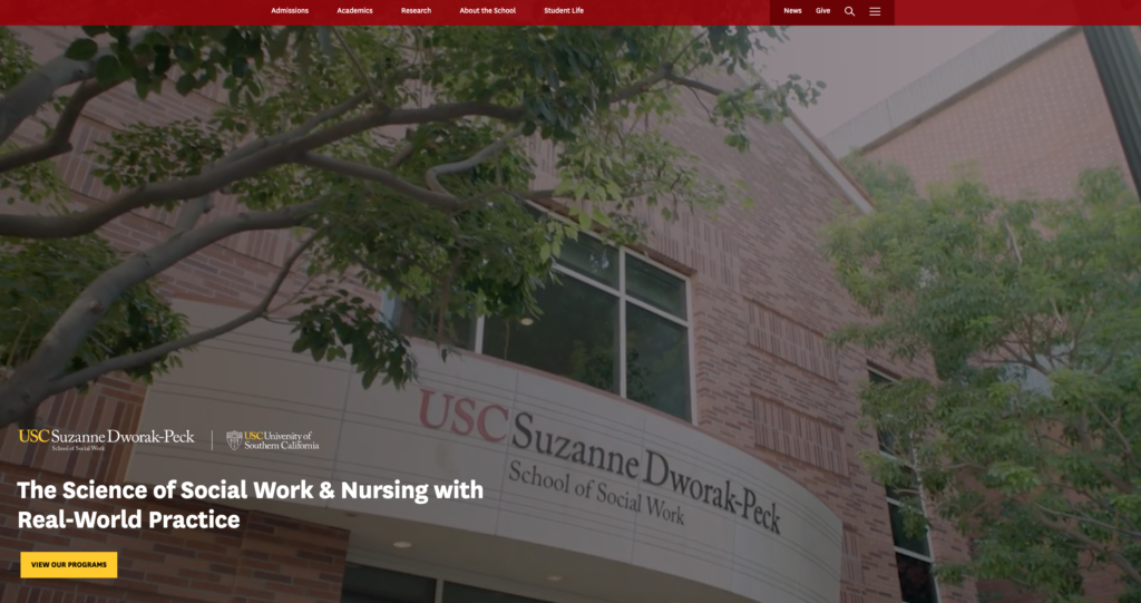
Findings and Recommendations: The new website design was well-received by study participants. “Innovative,” “professional,” “clean,” and “bold” were words used to describe the site. We gave the recommendation to eliminate or repurpose the areas beneath the homepage hero to continue to align with the ease of site navigation. For example, one user felt that the large news story below the hero video on the homepage was a waste of space. The user wanted to use that space for a student profile or an image gallery to add to the feelings of “innovation” that the participants felt was missing on the homepage.
mStoner conducted a series of five A/B tests of different design elements and calls to action — topic navigation labels, location of global CTA, hero image caption and link, program page CTA, virtual tour CTA — on the Johnson and Wales (JWU) website.
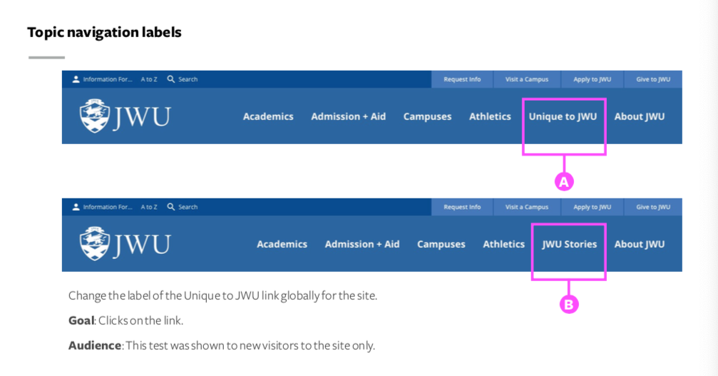
Findings and Recommendations: One of the elements we tested was the site’s main topic-based navigation. 0.61% of visitors clicked on “JWU Stories,” compared with 3.26% of visitors who clicked on “Unique to JWU.” We recommended JWU leave the original label, “Unique to JWU,” on the live site.
mStoner launched an online survey to summarize and analyze the responses of testing participants to guide concept selections and determine revisions to the Mills.edu design concepts. The testing goals were:
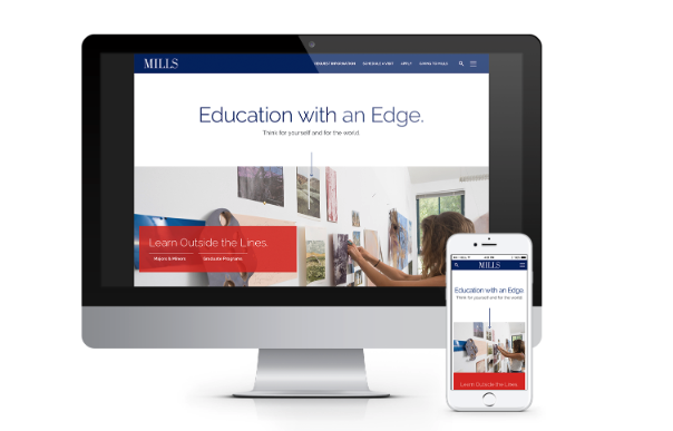
Findings and Recommendations: We recommended proceeding with “Concept Blue” (pictured above). Testing participants found this concept easy to use, modern and clean, and organized in a way that makes finding information very efficient. Participants liked certain elements of the other design concept, so we suggested pulling those elements into the template suite to reflect the other concept’s organization. Based on feedback and hotspot testing, the participants rated the organizational components of the other design concept more favorably.
Visit the website and read the case study.
After conducting user testing over the years with an array of audience segments, we’ve seen how important and impactful the findings can be to an institution’s website.
Shift your institution’s approach by establishing a regular rhythm for implementing changes and enhancements to your site.
In a recent webinar, now available for free and on demand, Voltaire Santos Miran, mStoner’s CEO and head of client experience, reviewed six things you can do to prepare yourself for ongoing site improvements or a full redesign — including user research.
Voltaire also recommends that you consider a site checkup, especially if you’re trying to bridge the gap between now and your next major web overhaul. A site checkup will provide objective feedback and give you and your team actionable information for improving your site immediately and identifying priorities for long-term development.
Learn about the other recommended next steps in Break Up With Your Homepage, ‘Cause I’m Bored. You’ll be given the inspiration and guidance you need to make your next website iteration, starting with your homepage, distinct and compelling.