During the past couple of years, I’ve been a judge for CASE, UCDA and CASE District VIII. One of the benefits of serving on judging panels is you get the chance to see some incredible work from talented people on campuses around the country. Really, there’s a lot of good higher ed admissions stuff out there. For your inspiration, this post includes four student recruitment sites that caught my eye while judging.
All four of the sites I will mention here were winners. The Biola Undergraduate Admissions site was a 2011 CASE Circle of Excellence Silver Award winner. Washington State University and Pacific University won gold and silver, respectively, in the category of Websites: Student Recruitment Subsection of the 2013 CASE District VIII Communications Awards. The fourth site, Eastern Illinois University’s Admissions, won Gold in the 2012 UCDA Design Competition.
In my view, all of these sites are strong examples of what a student recruitment website needs to be. Are they perfect? No. Do they inspire? Yes. The four sites I reference here display four characteristics I think are important for admissions sites:
- Be who you are.
- Know your demographic.
- Feature the academic programs.
- Make it high impact.
Be who you are.
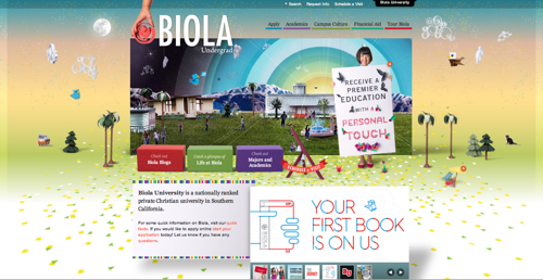
As soon as you land on the Biola University site it feels different. From the color palette, to the welcome to our world theme, this site is probably an immediate “Yes, I want to apply!” for some, and a “Nope, this isn’t for me.” for others. Biola understands that you get right fit students when you give prospectives an authentic view of what you are and what you are not. I think one strength of the Biola site is that prospective students immediately know this is an all-Christian community. The brand of Biola is clear and bold.
I also like:
- The student blogs on Tumblr.
- “Majors” and “Life at Biola” as front and center navigational elements.
- The use of illustration and graphics to enhance photography (see the Campus Culture section of the site).
Know your demographic.
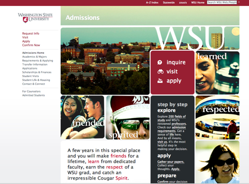
The Washington State University site has an Instagram feel that is well-suited to the high school student demographic. The treatment of the photography, the choice of typography and the layout are all really appealing. With very little text, the homepage packs a punch and quickly responds to many of the interests, worries and fears of 16- to 18-year-olds looking at colleges. (The site also looks good on a phone!) The Washington State University site connects with the demographic.
I also like:
- The fixed left-column menu.
- The many ways you can interact with the site.
- The WSU Admissions Pinterest.
- The Fields of Study graphic on the “Academics & Majors” page.
http://admission.wsu.edu/index.html
Feature the academic programs.
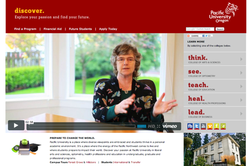
Pacific University uses five landing pages — “think. see. teach. heal. lead.” — to cover academics in a compelling and meaningful way. The left-column menu on each of the landing pages is the list of majors! Pacific offers detail about the academic programs in a digestible and informative way.
I also like:
- The short videos offering a sense of place and culture.
- The theme lines like “Sometimes the biggest ideas come from small places.” and “Bring your imagination to the global marketplace.”
http://www.pacificu.edu/discover/
Make it high impact.
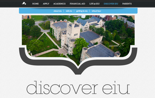
The Eastern Illinois University Admissions site is high impact. The use of color and photography is strong and the texture in the background is cool. The copy on this site is also high impact: “The deal goes like this. You give us four years, and we give you a future. You give us your best effort, and we give you devoted faculty and staff who work with you to ensure you reach your highest potential.”
I also like:
- The simple navigation (the menu labels are super clear!).
- The Life @ EIU section.
- The theme lines throughout (“When overthinking is a good thing.)
http://www.eiu.edu/admissions/
More on student recruitment from the mStoner blog:
- How to build better major and degree pages. (Doug Gapinski)
- Telling Your Research Story (Kylie Larson)
What’s been catching your eye?
Let me know about your favorite student recruitment websites. I’d like to feature more of them here.