
“We had talked about moving from project to process with mStoner, where we’re not doing these huge, full redesigns every five years but we’re constantly making improvements,” said Jonathan Shearer, Elmhurst’s executive director of marketing and communications. “So we realized: Wouldn’t it be perfect to align the website refresh with the institutional name change as part of the official rollout?”
In just a few short months, the Elmhurst University and mStoner teams collaborated on a refreshed homepage design to coincide with the new name.
Discovery; analytics and measurement; CMS implementation; responsive HTML/CSS development; web development; quality assurance testing; website redesign; user interface design; information architecture; UI design systems and webpage templates
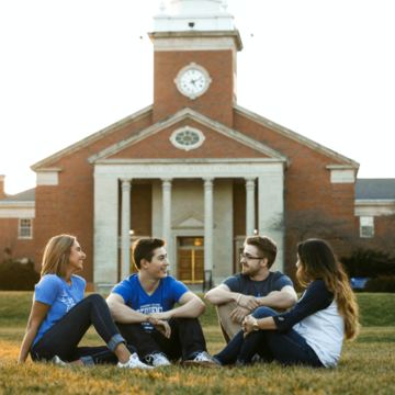
The website refresh had three overarching goals. The first: to show off. Elmhurst has experienced record enrollment and fundraising in recent years, as well as increased national recognition.
“We wanted a great platform where the Elmhurst University brand and promise would shine through the moment visitors landed on the homepage,” said Kaycee Woodford, U/X specialist at mStoner.
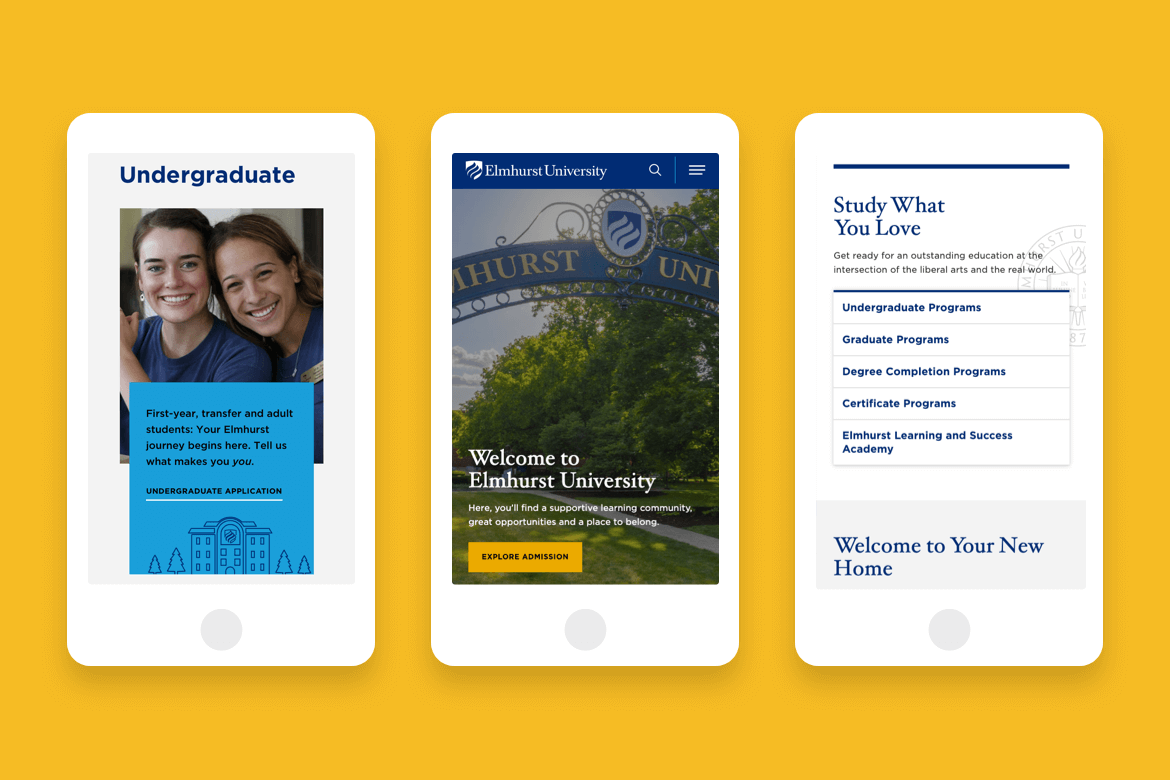
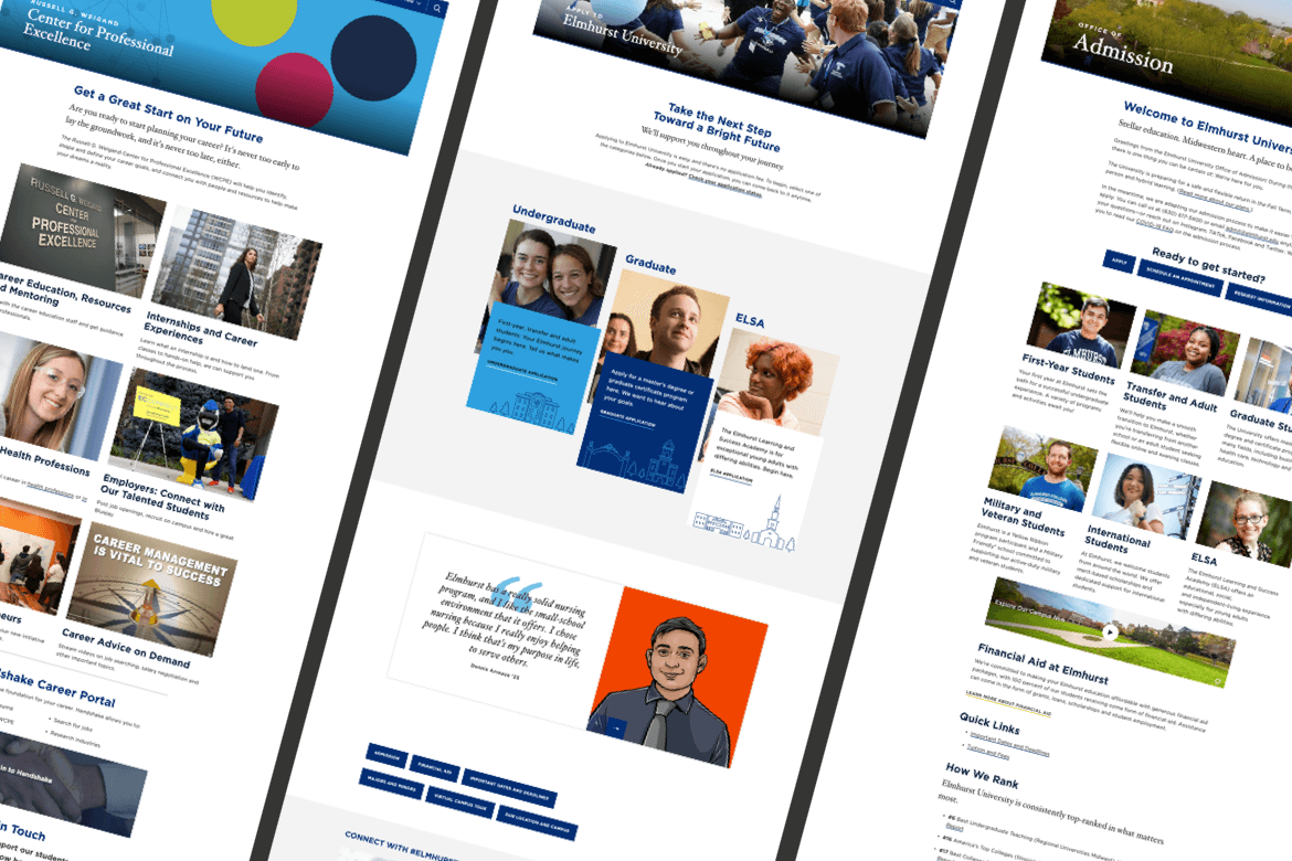
The second goal was to tell a more cohesive story on the homepage to prospective students while continuing to effectively serve multiple audiences. Finally, Elmhurst wanted to elevate its academic programs with a prominent position on the redesigned homepage.
“We wanted to establish a better narrative and hierarchy that focused on the student journey,” said Woodford. “From choosing a program to engaging in student life to learning about campus news and events, the flow of the page had to make sense.”


Elmhurst and mStoner’s close relationship began in 2017. Thanks to that initial redesign project, the two teams were able to deliver on these goals in a short amount of time.
“Elmhurst is a really great example of treating your site like a living, iterative project,” said Woodford. “There was no major redesign needed. It was just a matter of looking at the new brand, data, and client strategy to come up with a homepage that served them in 2020, as opposed to 2017.”
The teams were already speaking the same language. mStoner set up Google Analytics in a way that allowed the team to find precise answers to their questions using quality data. The technology was already firmly in place. And Elmhurst has worked to improve areas of its site since the 2017 relaunch, including starting a popular blog, building more robust academic program pages, and showcasing a redesigned university magazine. mStoner knew what the university could and should highlight in the refresh.
“The technology pieces of this project were easier because we really built on what we had previously created with Elmhurst, rather than starting over,” said Greg Zguta, mStoner’s director of client support. “On the homepage, there were elements we designed that were brand-new but there were several components we repurposed and restyled. We’re not reinventing — we’re building on the work we did. We were able to do it faster, and we were able to extend it further.”
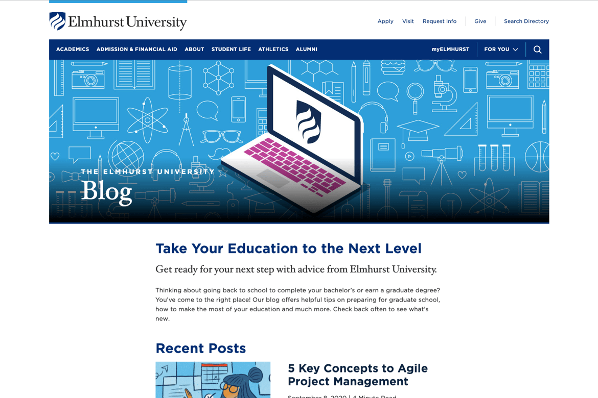
The homepage refresh started at the top: mStoner designed a multitiered alert system and a reworked header that applied sitewide.
“The dropdown navigation was serving them well. Our biggest lift was making sure the links in the dropdowns were high performers and were organized in an intuitive way,” said Woodford, who relied heavily on visitor data when crafting the new top-level information architecture.
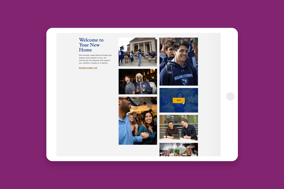
The new design incorporated Elmhurst’s new brand colors and look and feel, and it brought movement to the hero space with a dynamic video highlighting the beautiful campus and new Elmhurst University Gates of Knowledge. A new call-to-action component that turns on or off allows the university the option to feature something timely, like an upcoming admission deadline or a major news story, without drawing attention away from the larger page narrative. New modules and incorporating effects on scroll and side-scrolling on mobile encourage deeper interactions on the page.
The larger page narrative tells Elmhurst’s story while answering a prospective student’s biggest questions:
— Jonathan Shearer, Executive Director, Marketing and Communications at Elmhurst University
News and events — not usually top priorities for prospective students — still feature prominently on the homepage. But they use much less real estate and are presented in a way that doesn’t interrupt the flow down the page. Highly visual components presenting the blog, social media accounts, and a virtual tour give visitors multiple points of interest and encourage exploration.
Initial results indicate visitors find the content engaging and the site well-organized. New components garner more clicks than the previous version: a 7.5% increase on desktop and a 5% increase on mobile. Heat maps show visitors scroll further down the page than on the previous site.
The new header and navigation menu are getting people where they want to go. Click rates have increased on the Apply, Visit, and Request Info links, and traffic has increased significantly to the major navigation sections:


Next case study