
With deep backgrounds in fine art, mStoner creatives were eager to give The Rose a new website that presents its exhibitions as arrestingly as the halls of its galleries do.
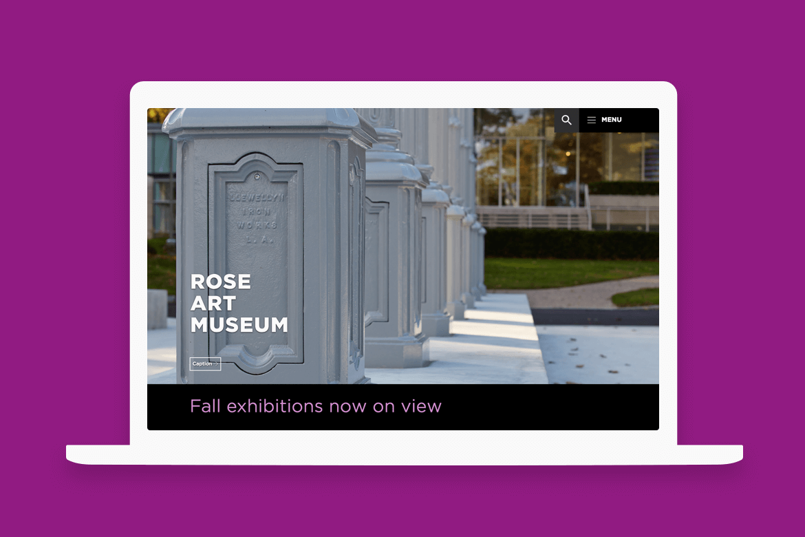
Among the museum’s goals for its new website, encouraging in-person visits ranked highest. mStoner’s strategy for inspiring visits focused on creating a digital experience that mirrored the feeling of walking through a gallery at The Rose. To accomplish this, the website had to get out of its own way and let the artwork light up the screen.
Web design for cultural institutions necessitates more emphasis on the visual browsing experience than the digital storytelling and linear narratives of higher education websites. After designing for an arts college and its museum and galleries for 10 years, mStoner Creative Director Ben Bilow knows that visitors rarely read a museum’s homepage from top to bottom: “Instead, visitors scan for the images that resonate with them the most and then click to see where that piece came from. Did it come from the permanent collection? Is it part of an upcoming exhibit? Is there a lecture I can go to? We’re not trying to tell a story about the museum. We want people to look at the art and come visit.”
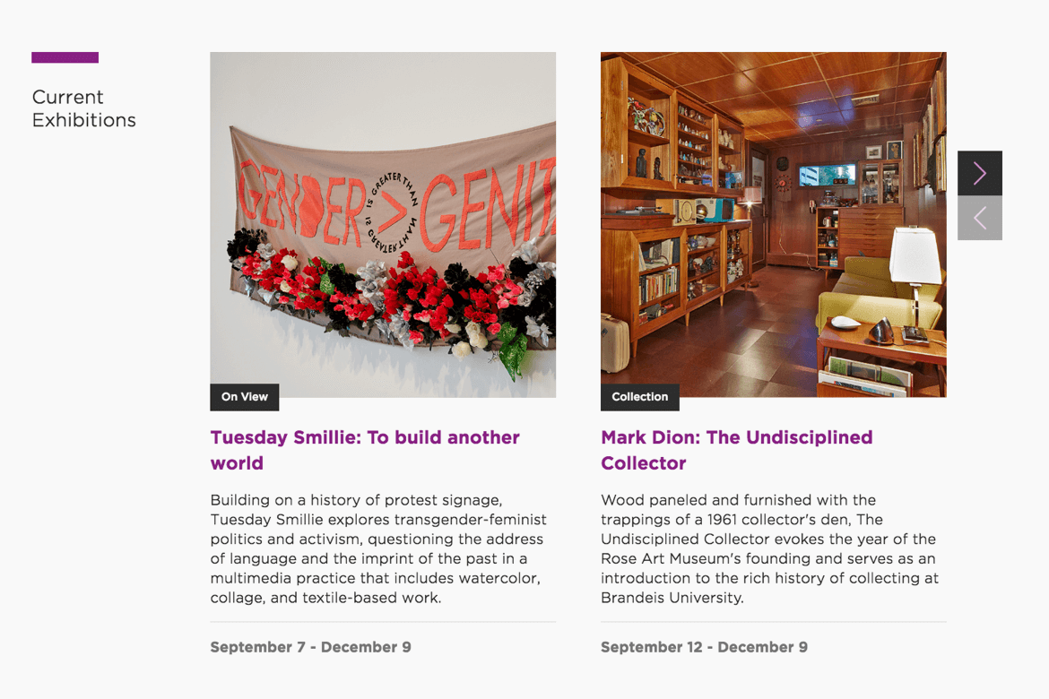
The expansive hero images on exhibition pages display a single work of art in enough detail to reveal individual brushstrokes, the weave of canvas, or the paper crinkles in a multimedia collage.
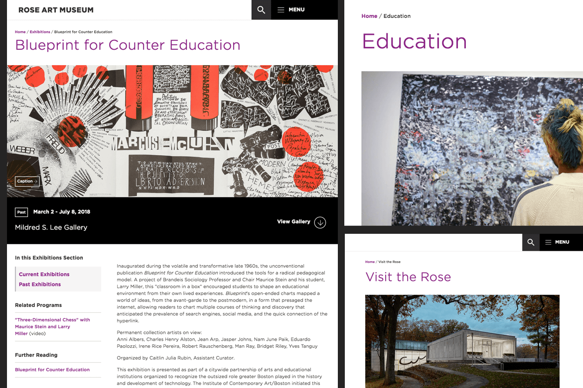
The museum’s artwork, therefore, is the biggest element on the new site. mStoner’s design turned the artwork’s caption into a call to action that mimics the card on the wall in the gallery. The site design gives everything else — the navigation, the text, the background, the social media feeds — a minimalist treatment so it won’t distract from the exhibition and collection pieces.
Because current and upcoming exhibition pages make up the most important content of a museum’s website, mStoner’s design gives each exhibition a landing page that looks and feels as important as the museum’s homepage itself.
— Ben Bilow, mStoner Creative Director
As such, the social media strip at the bottom of the homepage is nearly unrecognizable. With no section label and no immediately visible tags, icons, likes, or captions, the museum’s Instagram feed thoughtfully conforms to the art-first theme of the entire design. Because the feed depicts artwork and artists, it contributes to the feeling that The Rose is a vibrant, artist-driven, culturally relevant place.
The feed formatting also downplays outgoing links to keep visitors on The Rose’s site. Bilow explains: “The latest best practice is to either keep visitors on social or keep them on your website. You want to discourage people from going back and forth. Instead, you want to celebrate stories in both places and keep people engaged in your stories, wherever they are.”
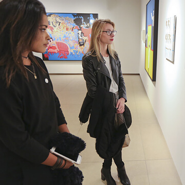
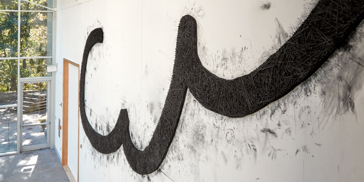
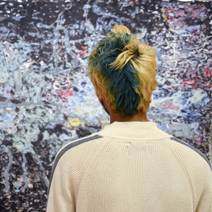
Cultural institutions the world over are searching for ways to convey their vitality and relevance. If The Rose Art Museum’s new site accurately reflects one aspect of the institution, it would be its intense diversity. Within the boundaries of this glass-walled gem of free expression, a lot of variation exists. The intentionally designed five-second impression of the homepage shows visitors that photography, print, sculpture and multimedia are waiting to be explored. Many of the artists are people of color, as are the visitors included in the Instagram feed. The titles of exhibitions and the subjects of the artworks themselves run the gamut from the controversies of our culture wars to contemporary takes on classic portraiture.
All we needed to do was give it space.
Content and web strategy; information architecture; user testing; responsive redesign; four page design templates; art direction assistance; thematic CSS development; programming assistance; quality assurance testing
Next case study