ND.edu displays optimally on browsers of all sizes, and they also have a custom mobile site. How did Notre Dame deploy such powerful solutions for reaching all audiences, and how did they manage to do it with only internal resources? We sat down and spoke with Erik Runyon, Manager of Interactive Development at Notre Dame to find out.
Why should people care about responsive design and mobile sites?
It all comes down to developing content for visitors and delivering a good experience for them. More and more people are accessing the web on different kinds of devices, and we need to deliver content thats formatted for all devices. In a recent survey by Noel-Levitz, they noted over half of all college-bound students will access institutional sites on mobile browsers while investigating which College or University to attend. This is an example of how we need to be prepared to deliver content in a way thats optimal for different viewing environments.
What inspired you to take this approach for ND.edu?
At Notre Dame, we have a long history of trying to make things accessible. Mobile and responsive sites are a part of that traditionits a way of making web content more accessible to more people.
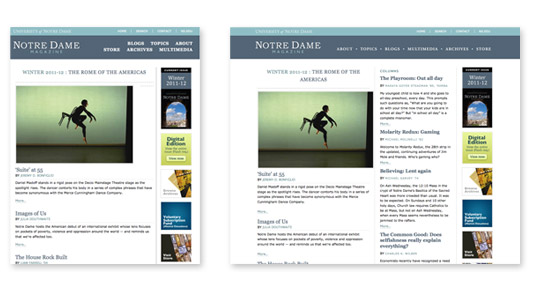
In March of 2011 I started getting into adaptive design. It began with the Notre Dame magazine site. Because a a magazine site is primarily for delivering content, we wanted to make a solution that would work for the desktop or for tablets in both landscape and portrait, and so we retrofitted the site to use an adaptive layout (not fluid, but layout changes at specified breakpoints).
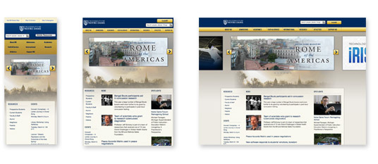
A couple of months later, in May of 2011, we started making ND.edu adaptive. We set up break points and conditional style sheets so the site would render well if someone accessed the site from a mobile phone or tablet. This wasnt a fully responsive design though. It had hard breakpoints as you collapsed the browser and did not have fluid containers.
On June 7th, 2011a FridayI bought Ethan Marcottes book on responsive design. I read it over the weekend and I saw the logic of taking a responsive approach rather than an adaptive approach. Responsive is more scalable because we really dont know how resolution is going to work on future devices. It follows the logic of some fixed breakpoints for devices, but also uses fluid widths. So basically, you render down to the browser size, rather than just the device. I got started on the reworking our stylesheet and html to be fully responsive. To make the switch from adaptive to responsive (stylesheet, html, media queries) took me about 3 days.
Who did the visual design on the current version of ND.edu?
The talented Tim “Oak” O’Connor. It is worth mentioning that in April of 2012 we will be transitioning to a new design by another great designer, Philip Zastrow.
Are the reasons mobile and responsive design are particularly important for colleges and universities?
To me, the need is the same: to deliver content to different audiences on different devices. I can imagine that in .edu we have smaller budgets than many corporations, so we need to stay focused.
How did you deploy a custom mobile site?
I started on the current version of the Notre Dame mobile site in late 2009. I heard that two other people from the Academic Technologies group at ND.eduPaul Turner & Xiaojing Duanwere working on something similar. Xiaojing got in touch with me and we combined our efforts in Github. We began with the MIT Mobile OSP code base and hacked it to add additional features. We worked with a great internal designer named Jim Gosz on the interface, and launched the mobile site about 4 months after we began.
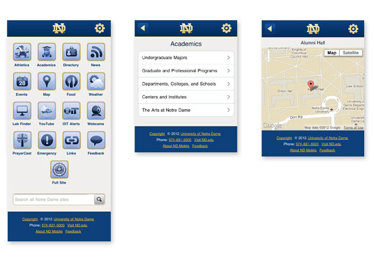
We continue to add content to our mobile site. It originally launched with very few categories. I think thats important for institutions to consider about mobile sites: get something out the door, then continue to refine it over time. Theres no reason a mobile site needs to be totally robust when it launches.
Is m.ND.edu integrated in your content management system?
Our mobile site is now managed as standalone code base on Github. It does pull some content from our CMS, Conductor. Conductor is a custom Ruby on Rails CMS that weve built internally here at Notre Dame.
What should designers and developers think about as they tackle a responsive design?
First and foremost, information architecture needs to be addressed. That should be the first step of any site, not just a responsive design. After that, the order of the content should be considered. If designers begin with a 960 or so pixel view, they need to consider how things will move around as the browser collapses. I dont think its necessary to design a Photoshop document for each instance, but conversations need to happen about how things will work at critical sizes.
Download size is another thing to consider. Unfortunately, as broadband has gotten larger, developers and designers have pushed the idea of keeping page weight down out of the window. Now that were moving into responsive design and trying to deploy code and content to mobile devices with less bandwidth, the web community needs to pay more attention to the total size of their pages and sites and how much were throwing at visitors. We need to concentrate on keeping things light.
More testing time is required for responsive design. For testing you should set your break points and then figure out the fluid elements. As I worked on the current version of ND.edu, I just began scaling down and seeing where the layout broke, and then applied styles to clean it up.
How are you handling responsive design as you get more requests for work from faculty and staff at Notre Dame?
Were now doing responsive design for every new site request we get. Its an approach that will really cover the needs of most departments and administrative units. I have 3 developers reporting to me, and weve developed built-in standards for how were laying out code. Following a consistent system makes it easier for us to work together and build responsive sites quickly.
Part of deploying responsive design across campus is educating people that this is part of how we work and deploy sites now. Last month, I presented to the Campus Communicators Network at Notre Dame about the importance of responsive design. Campus Communicators is a large group of people who maintain content and sites for different department and academic sites at Notre Dame, and once a month we do a brown bag lunch to talk about important issues.
How has traffic to ND.edu from mobile and tablets increased over the past couple of years?
Heres a snapshot of monthly mobile visits to our homepage from two years ago vs. now:
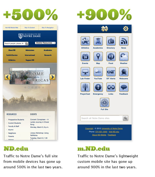
ND.edu January 2010:
1% traffic from mobile (14,943 mobile visitors)
ND.edu January 2012:
5% traffic for mobile (58,282 mobile visitors)
Thats roughly a 500% increase in mobile traffic over about two years. If you look at overall traffic on all of the sites we manage in our CMS (Conductor), the traffic from mobile devices is currently around 8%.
The previous numbers are traffic to ND.edu pages. If youre looking for traffic specifically to our custom mobile site (m.ND.edu)from Jan 2010 to Jan 2012 weve seen a 900% increase in the amount of traffic it receives. It also gets huge spikes on game daysalmost 700% increases in traffic.
Are people accessing different content on the mobile site than they are the desktop / tablet version of the site? In other words, what kind of different content do visitors look at on a smartphone vs. a desktop machine or tablet?
Heres a breakdown of what people are looking at on desktop machines vs. mobile devices, and a separate category for m.ND.edu traffic.
Visits to ND.edu from desktop browsers from January 2011 to January 2012:
sights and sounds (webcams, pictures, etc): 5%
admissions: 3%
current students: 3%
academics: 2.3%
about: 2.2%
Visitors to ND.edu from from mobile devices from January 2011 to January 2012:
admission: 7%
sights and sounds: 5.6%
about: 5.5%
academics: 4.6%
current students: 3.2%
Visitors to m.ND.edu (our custom mobile site) from January 2011 to January 2012:
athletics 16%
map 12%
news and events (combined) 6.6%
food (for students to see whats being served today): 6%
academics: 5%
webcams (basically we think of this as sights and sounds for mobile): 4%
people: 4%
Are there things about tackling mobile and responsive specifically for .edu that differ from the way other industries tackle mobile/responsive?
The thing we havent had to deal with yet is ad sizes. Dealing with responsive when you have fixed ad sizes is a trending topic in responsive design outside of higher education.
If you had to do it over again, what would you do differently? This question applies to mobile and responsive project.
If we had to do m.ND.edu we might build our own code base for it. Wed probably build a Rails option instead of using the MIT OSP code base since it would fit the family of our Conductor code better.
For responsive… based on the history of how we deployed everything, we couldnt really apply Luke Wroblewski’s mobile first approach. I agree with his philosophy though. Were in the process of redoing ND.edu though. For that, we are applying a mobile first approach methodology.
What do you recommend for people who want to learn more about these topics?
Responsive Web Design by Ethan Marcotte
MediaQueries (just to see what others are doing and what’s possible)
Weedy Garden (my own blog)
Dave Olsen’s Blog
Who should people interested in this topic follow on Twitter?
@bdconf great conference, but also great responsive links
@lukew Luke Wroblewski on Twitter
@beep Ethan Marcotte on Twitter
@dmolsen Dave Olsen on Twitter