So you’ve streamlined your information architecture (IA) and decided what stays and what gets thrown away. Now it’s time to take it to design and create a global navigation for your brand new website. Huzzah! But wait! You still have a bunch of navigation, and you really, REALLY love it all. What should you do?
Well, my friend, let’s pull back the red curtain and answer some of the big questions surrounding current best practices for website navigation at the desktop viewport.
What is the navigation best practice for menu design?
The trick is to pick and choose between which links are prominently displayed, which take a back seat, and which can be consolidated into a mini-menu, drop-down, or menu drawer.
Our strategists at mStoner work hard to help our clients figure out what should make up the primary, secondary and audience navigation. When our designers take over, the goal is to find a nice balance between consolidating navigation and exposing it.
Finding this balance accomplishes three things:
- Navigation is easier to digest. Thirty exposed pathways in your navigation overwhelm your audiences. Users don’t want to spend time sorting through navigation to find what they desire. By consolidating and grouping IA, navigation becomes scalable and easy to … well … navigate.
- It provides a clear navigation hierarchy. It is a best practice when working with higher education websites to divide IA into four distinctive parts: Primary Navigation, Secondary Navigation, Audience Navigation and Search. We call primary navigation “primary” for a reason, and it should be kept front and center.
All other navigation should take a back seat and, when possible, be consolidated. mStoner designer Ben Conley sums up this thinking quite nicely:“There are a variety of factors that can lead to condensing a group of buttons into a drop down menu, before even getting into mobile considerations. Form follows function when designing for the web. Getting a secondary or tertiary group of links into a drop-down menu not only has the desired aesthetic effect of cleaning up the site’s navigation, but it also brings more emphasis to main calls-to-action and can enforce the strategic goal of directing users to a desired destination.”
- It allows for more visual real estate for content. Navigation needs a home. A lot of exposed navigation needs a mansion. Keeping your IA concise prevents navigation from taking up too much space. Remember, content is the true star.
Why not just consolidate all the navigation into one place?
The famous hamburger menu is a great solution for a responsive website when screen sizes become smaller. However, storing all of your site’s navigation in one menu drawer at the desktop level is not without its pros and cons:
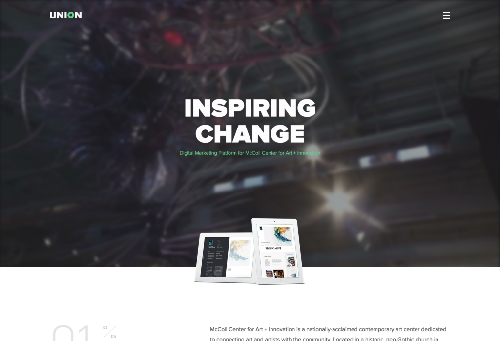
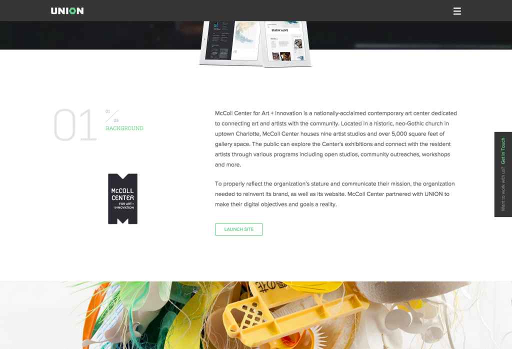
- Pros: By storing all of your navigation in one menu drawer, you allow the user to focus immediately on page content. This approach is great for microsites and websites that have very little IA. Websites with this approach should have a strong foundation in digital storytelling, because the user’s primary impression will come from the content. The McColl Center for Art + Innovation (shown below) is a great example of this approach.
- Cons: The fundamental con of a hamburger menu is that it hides the IA. This approach is a big con for websites that have a lot of valuable content outside of the primary homepage. Another con of one major menu drawer at the desktop level is that it creates an additional click for the user in order to get to understand the site’s framework.


So what does a successful navigation look like then?
Website navigation at the desktop level should be clean, clear and spacious — like my apartment before Mom visits. Primary navigation should be prominently displayed. All other navigation should take a back seat and be kept in sub-menu drawers when possible. Finding that perfect balance between exposed and stored IA will create scannable and sortable navigation that does not overpower the most important thing … content!
Some great examples are shown below:
- The Next Web chooses to expose only two social media channels, while keeping all others in a “more” drawer.
- Gap uses the hamburger menu to hide all of its filtering options.
- mStoner redesigned the website for Fordham University and consolidated the audience navigation into an “Info For” drawer.
- For Capital University’s website, mStoner created three distinct menu drawers. This allows users to quickly scan the navigation categories to find exactly where they should be going. mStoner also made the strategic decision to house important calls-to-action outside of the navigation. On deeper dives into the site, the respective menu drawer stays exposed in order for the user to access desired navigation without having to open anything again.


References and further reading: