What’s the best way to organize navigation to offer the optimal user experience on your website?
For the last few months, the mStoner team has been working to crack that code. By collecting data across dozens of institutions, we’ve researched the performance of various navigation styles in an effort to figure out what works best. And we have some insights into the answer to that question.
Spoiler alert: There is no “best” way of structuring or designing your navigation, as it all depends on — you guessed it — strategy.
We’re excited to walk you through our findings, how we’ve interpreted them, and what they mean to you from the perspective of your communications strategy.
Since we looked into a number of different elements, we’re offering our findings as a series of three posts here on our blog. Stay tuned for our latest Intelligence!
Navigation Styles: Hamburger – or Not
One of the top questions we get as a web design agency is whether to employ hamburger menus on desktop screens. This is a good question: hamburger menus have gained popularity in the age of mobile-first design. Typically, they allow for a simplified, more breathable navigation. Employing a hamburger on a website also accommodates the cleaner, minimalistic design styles that have been trending year after year.
However, like with many questions in user experience design, there isn’t a straightforward answer. To illustrate why, we analyzed just how well hamburger menus perform compared to other popular navigation styles.
First, though, let’s get familiar with three common navigation styles:
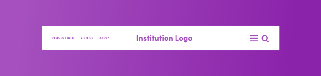
- Hamburger: Hamburger menus hide a site’s primary navigation behind an icon that consists of three lines stacked on top of each other, resembling a “hamburger.”
- Exposed: Exposed navigation displays all primary links across the top of the site. There’s no dropdown on these links, and upon click, they direct to a landing page.
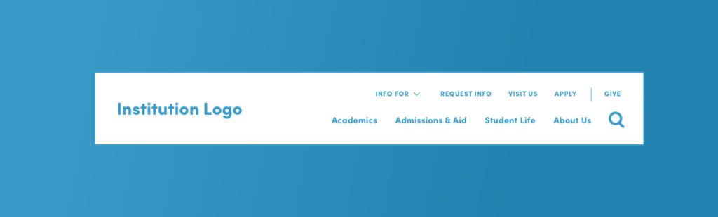
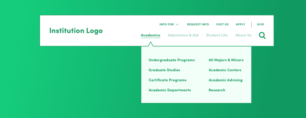
- Mega Navigation: Mega navigation consists of an exposed set of primary links, but, in contrast to the exposed navigation style, the links themselves trigger dropdown menus with clickable secondary links.
Disclaimer: We realize there are other ways to structure a site’s navigation. However, these are the three most common and the ones we employ most often on our clients’ sites.
Next, it’s important to outline our means and methods of analysis.
We used Google Analytics as our data source and analyzed 37 education institutions for this study. For sites that have been live for one year or more, we looked at the data between June 1, 2019 — June 1, 2020. For sites that were launched after June 1, 2019, we adjusted the start date to align with the launch. And, for this study, we focused on data for desktop viewports.
We approached our analysis from several angles, believing that each would yield a different view of the data and influence our overall conclusions. Additionally, we chose data points that would apply to most sites with standard configurations in Google Analytics:
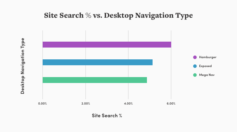
- Site Search Rates: Seeing how many users utilized search on a site with a specific type of navigation tells us which style offers the most findability for what users are looking for.
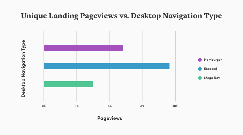
- Unique (non-entry) Pageviews on Landing Pages: More often than not, the primary links in a navigation direct to “landing pages.” These pages often have rich content and serve as a user’s introduction to the institution. By looking at the unique pageviews on these pages, and excluding entry traffic, we can narrow down the users who likely used the navigation to find these pages rather than entered them directly.
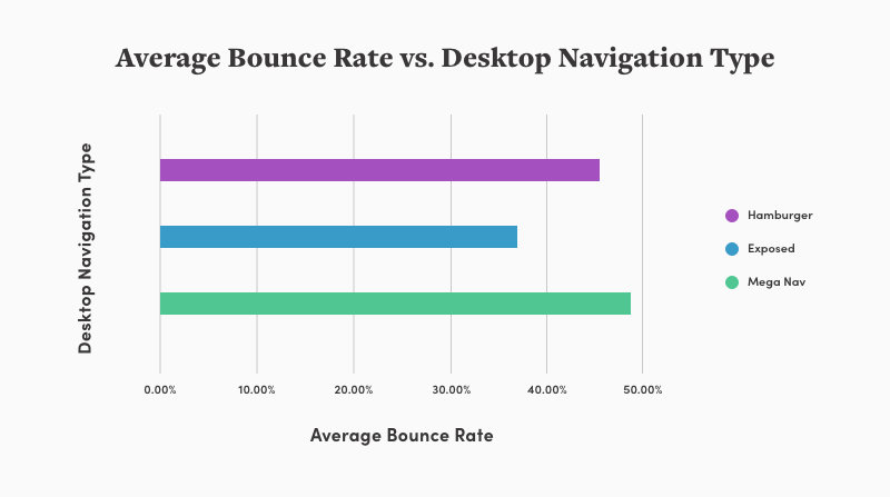
- Bounce Rates: Bounce rates help us understand if there’s any correlation between navigation styles and users leaving the site before exploring any of its content.
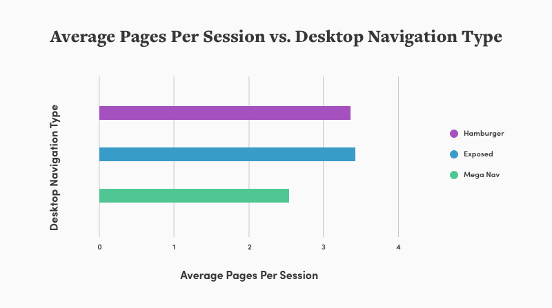
- Pages per Session: Looking into average pages per session on a site allows us to gain some insight into how much content users are digesting per navigation style.
Great, thanks for hanging in there! Now, let’s get to the good stuff.
Our findings:
- Site Search Rates: Sites with hamburger menus see on average the highest rates of site search. The other two styles have lower rates, with mega navigation landing a full percent below hamburger.
- Unique Pageviews on Landing Pages: Sites with exposed navigation have twice as many pageviews on landing pages than mega navigation, and 1.5x more than hamburger menus.
- Bounce Rates (the percentage of single-page sessions in which there was no interaction with the page): Sites with mega navigation see the highest bounce rates, 13% higher than sites with exposed navigation.
- Pages per Session: Sites with mega navigation have the lowest average pages per session, with nearly a full page less than exposed navigation.
What does it all mean?
With all of this data, we’re able to draw some conclusions about when to employ a particular navigation style for your .edu.
- When to use hamburger navigation: Sites with hamburger menus have higher rates of site search. Not surprising, because primary links are an extra click away compared to the other two navigation styles. As such, hamburger navigation would work best on a site that has accurate and somewhat robust search capabilities. To learn more about best practices for UX and site search on higher ed websites, check out our recent whitepaper, The State of Site Search on Higher Ed Websites 2020. Additionally, with this navigation style, we see that users are seeking out more content: they’re looking at more pages per session. As a result, we recommend that when using hamburger navigation, you be especially mindful of brand storytelling and consistent tone in your content in an effort to encourage exploration. Finally, this style works best for smaller institutions that have fairly homogenous audiences. Given that there’s a single starting point for navigating the site, it makes sense to employ this style when users have similar journeys and content needs. For example, a hamburger menu may work better for a small private college than it would for a 30,000-student public institution.
- When to use exposed navigation: Exposed navigation is associated with high traffic to key landing pages. It is especially beneficial for institutions heavily focused on brand and storytelling. By (gently) forcing users to landing pages, site designers encourage them to consume more rich, brand-driven content and visual assets, which help them to get a better sense of an institution’s values, mission, and community. Since this style has the lowest average bounce rate, it seems that users aren’t “driven away” by going down this more traditional funnel of homepage > landing page > tertiary page. Exposed navigation works well for small- to medium-sized colleges and universities with moderately homogenous audiences. While the navigation is more obvious and readily available than the hamburger navigation, users are still forced (again, gently) to take specific paths in order to find deeper levels of information. Institutions want to ensure that the landing pages are accommodating all users, without necessitating information that is too broad.
- When to use mega navigation: Sites using mega navigation have the lowest rates of on-site search. This makes sense because the navigation offers immediate access to tertiary-level pages, making this style useful for institutions that may not have a robust search feature. In the same vein, low traffic to landing pages tells us that visitors use more specific navigation, opting to bypass landing pages in favor of getting granular information more quickly. Low average pages per session indicate a shortened user journey. So mega navigation is useful for institutions that can’t dedicate the time or budget to developing strong brand messaging and quality visual assets on landing pages. Mega navigation provides many immediate wayfinding options that can accommodate a variety of users. Larger institutions with a wide array of audiences (i.e. a 30,000-student public institution) are in the best position to utilize this style. Providing mega navigation in this case would mean users are able to find highly relevant content quickly and with little friction.
To sum up our conclusions, here’s a nifty table that demonstrates which site and institutional qualities are associated with specific navigation styles:
| Hamburger | Exposed | Mega Nav |
| Brand & Storytelling | Strong | Strong | Moderate |
| Visual Assets | Strong | Strong | Moderate |
| Search Audience | Robust | Moderate | Low-Moderate |
| Target Audience | Homogeneous | Moderately Homogeneous | Varied |
| Institution Size | Small | Small-Medium | Large |
Whichever navigation your institution employs, be sure to incorporate brand and content strategy as much as user data. And remember that having robust on-site search is an important goal for your site.
Most importantly, the decision needs to reflect the interests of your target audiences. Knowing what your users’ journeys look like, whether they’re fairly consistent or highly segmented, will help identify the most beneficial navigation style for your site. And if you’re unsure of just how varied your audience is, then it may be time to consider experience mapping as a first step to learning how you can best accommodate them.
This is the first post in a three-part series about organizing your navigation for the optimal user experience. Read Part 2: The Give Button, and stay tuned for the final post, coming soon!
