
Any higher ed marketer worth their salt knows the importance of calls to action (CTAs). Critical elements of your marketing strategy, CTAs drive visitor flow on your website, help you reach goals, and convert students. If you do them well, your website will be easier to navigate and you’ll see improved results for your goals and conversions.
Higher ed often focuses on the prospective student audience — and rightly so. Colleges and universities would be tough to operate without students, after all. The majority of the time, .edu CTAs direct prospective students to “Learn More,” “Request Information,” and “Apply Now!” But we all know that multiple departments vie for space on institutional websites, making those clear, direct CTAs even more important.
One of the most popular CTAs in higher ed is the Give button. Where should it go? Should it say “Give” or “Donate”? Do people actually click it?
These are the lingering questions many of our clients face when trying to decide how to handle the gateway to giving. Where to place and how to format the Give button can feel like a balancing act of trying to generate revenue while also staying true to the primary audience: prospective students.
Luckily, mStoner has performed an analysis that offers insight into just how much the placement and label of these buttons factor into engagement.
Let’s take a look at some of the most common places we see the Give button on institutional websites.
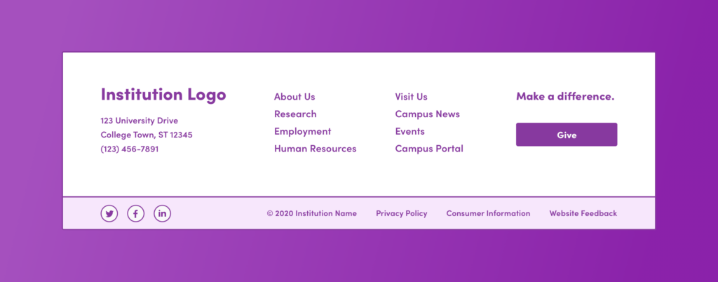
Often, the Give button is located in the header navigation, either on the left or right side of the screen.

The footer navigation is perhaps the most commonplace for a Give link. Usually, it’s a simple text link or in the form of a button.
We used Google Analytics as our data source and analyzed 24 educational institutions for this study. For sites that have been live for one year or more, we looked at the data between June 1, 2019, and June 1, 2020. For sites that were launched after June 1, 2019, we adjusted the start date to align with the launch. And, for this study, we focused on data for desktop viewports.
Our primary data point was percent of pageviews to the giving page. We measured the percentage of users who come to the giving page from the Give CTA versus those who come from other sources, such as marketing emails, organic search, or social media campaigns.
In our analysis, we also wanted to interpret the data from multiple angles. Knowing the questions we wanted to answer, we thought it was important to look into how both the location and label of the Give button affect the metrics.
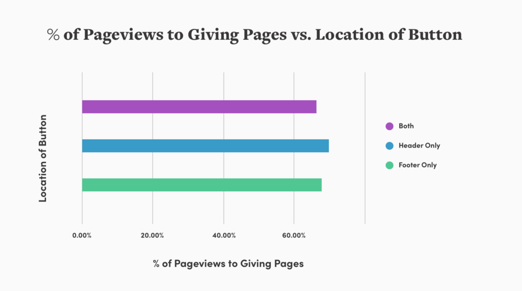
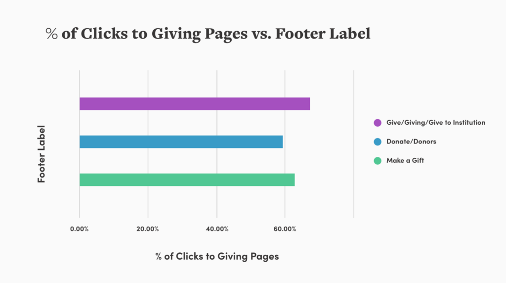
The data we’ve uncovered offers a simple solution to the giving conundrum: Users will find a way to give if the option is easy to find and clearly labeled.
However you decide to display your Give button, be sure that it’s reflective of your institutional strategy and takes into account your primary audience.
Additionally, it’s essential that your advancement team includes the button as part of your larger campaign strategy. By understanding how potential donors are entering your site, you’ll be able to make well-informed decisions about how and where to prioritize the button. We recommend digging into your own data to weigh exactly where key donor audiences are coming from (such as email, social, or direct) versus how much engagement your current button sees. When you’re able to rank the effectiveness of these pathways, you’ll be able to make well-informed decisions about placement, labeling, and styling of your site’s Give button.
This is the second post in a three-part series about organizing your navigation for the optimal user experience. Read Part 1: Finding Your Navigation Style, and stay tuned for the final post, coming soon!
Kaycee Woodford Director of UX As Director of UX, Kaycee Woodford translates research, analytics, client goals, and customer needs into solutions that deliver results.